
GRAPHIC DESIGN
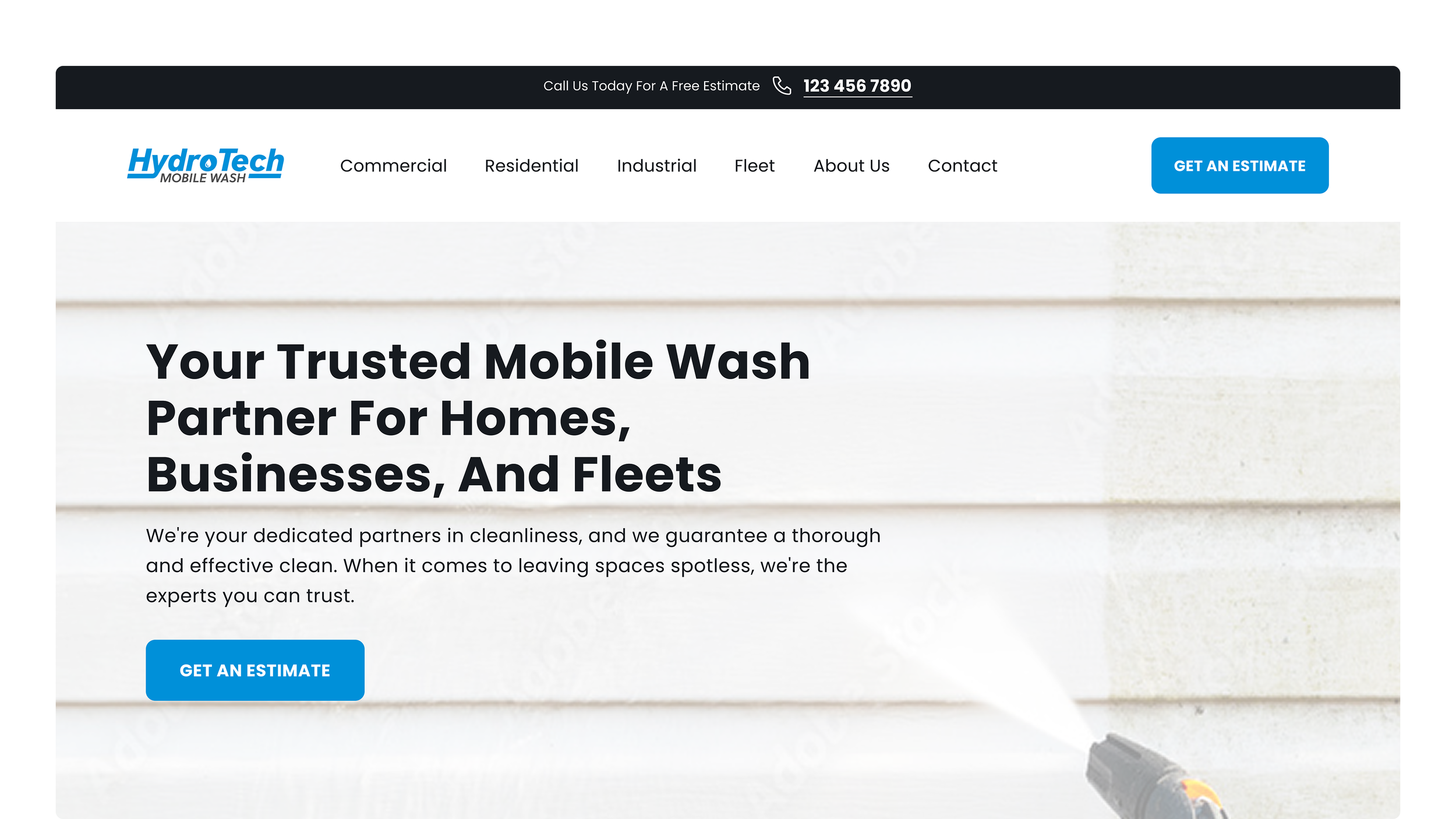
hydrotech mobile wash
Brand identity and web design for a new mobile pressure washing business. Built a complete brand presence from scratch under a tight launch timeline, with no existing assets to build from.
THE CHALLENGE
Speed was the primary constraint. The design had to establish trust and communicate the business's services clearly, without the benefit of existing brand assets, photography, or an established visual identity. Every decision prioritized what the business needed to launch, not what would be ideal with unlimited time.
Logo Design
The logo uses a clean typographic approach with two intentional details embedded in the letterforms. A water drop integrated into the logotype serves as a visual accent that can also function as a standalone brand mark. The underline beneath "ch" in Tech references the chemical symbol for chlorine—a subtle nod to the cleaning process that rewards close attention without being literal.
The result is a mark that feels professional and industry-relevant without relying on generic pressure washing iconography.
The HydroTech Mobile Wash primary logo in full colour.
Website Design
The website was built around clarity and conversion. The structure is simple, guiding visitors toward core services and clear calls to action with minimal friction.
My work focused on the service pages, where I designed a reusable layout system to ensure visual consistency across services, wrote concise value-focused copy, and sourced imagery that reinforced what the business offers without being generic.
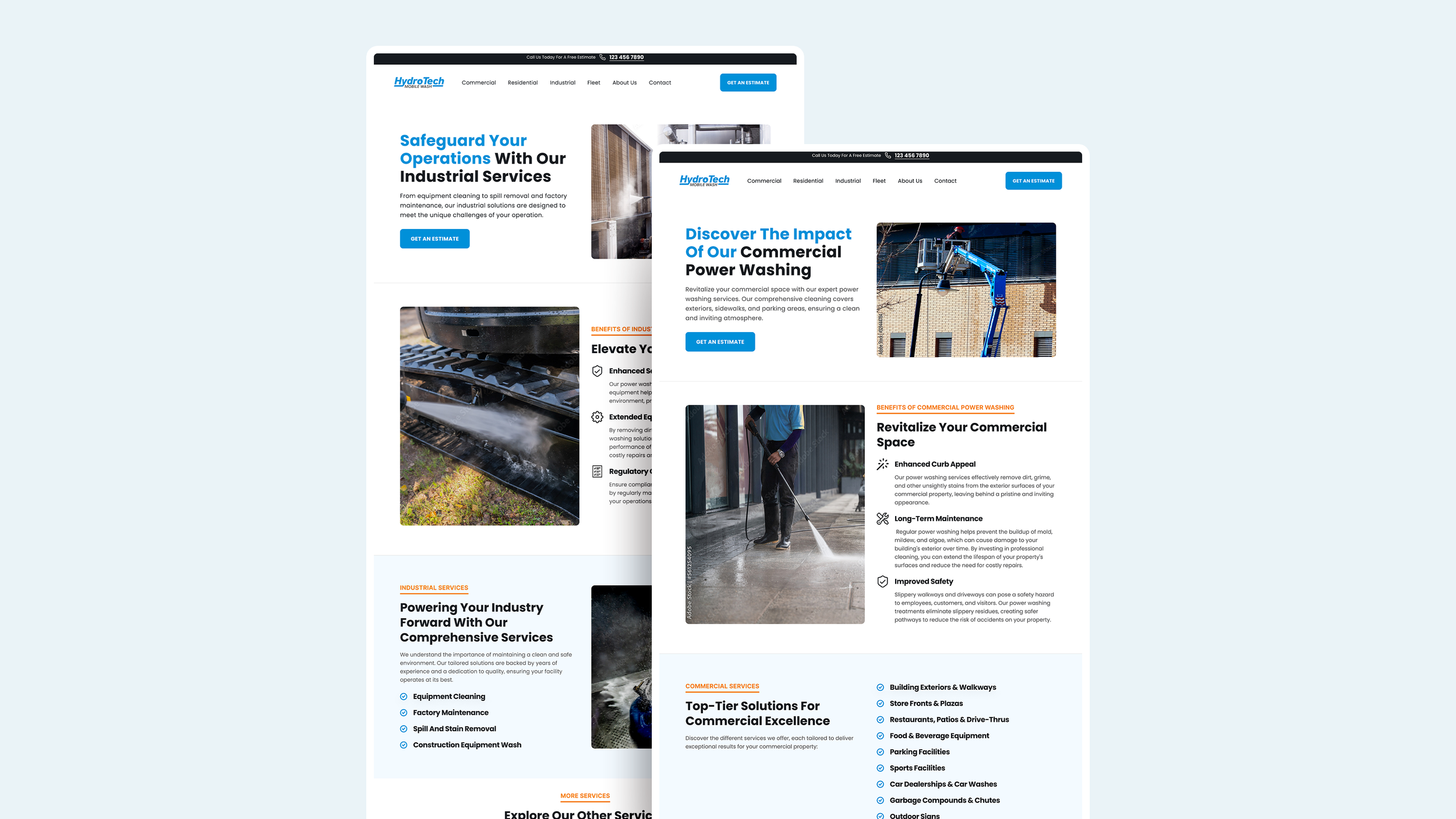
Service pages on the website with the reusable layout system.