
GRAPHIC DESIGN
optisigns packaging
Packaging redesign for a digital signage hardware brand. Replaced a cluttered, copy-heavy design with a product-first approach, and aligning the packaging with an updated brand identity.
OptiSigns makes digital signage hardware and software for businesses.
The project was to redesign the packaging for their Digital Signage Player to align with an updated brand identity and communicate product value more effectively at the point of sale.
THE CHALLENGE
The original packaging relied on stock imagery and screenshots of the OptiSigns web application to convey product features. The accompanying copy was dense and lacked typographic hierarchy, making it difficult to read quickly.
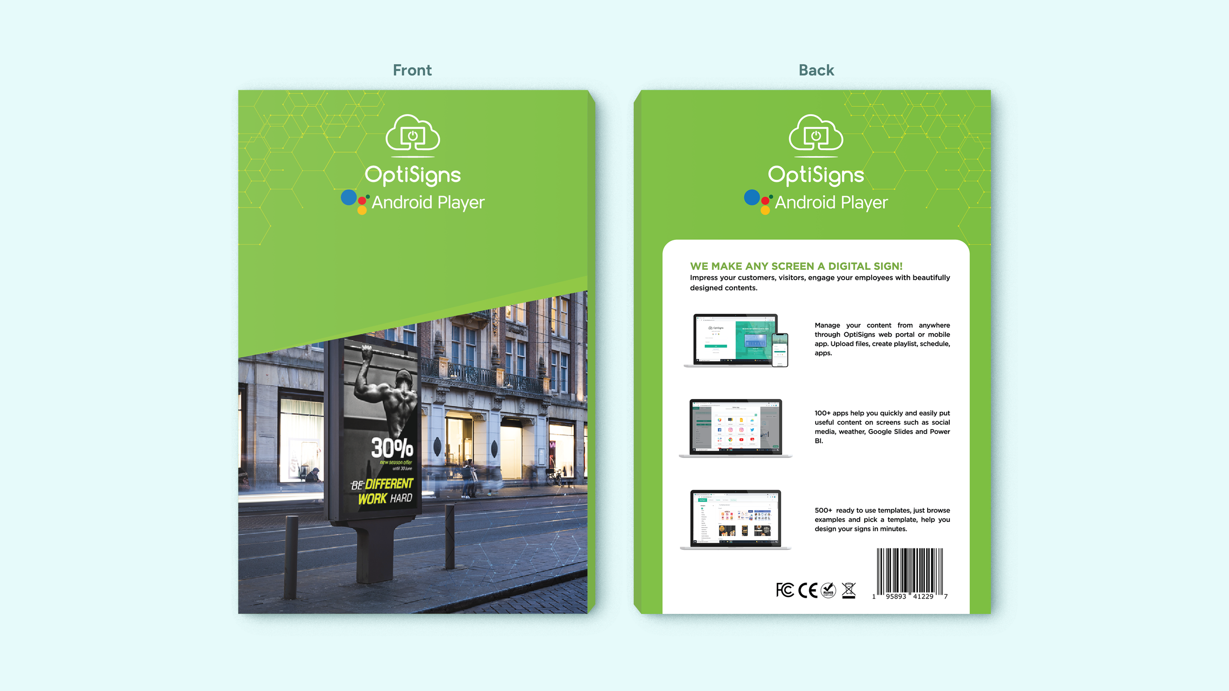
The front and back panel designs of the original packaging.
THE REDESIGN
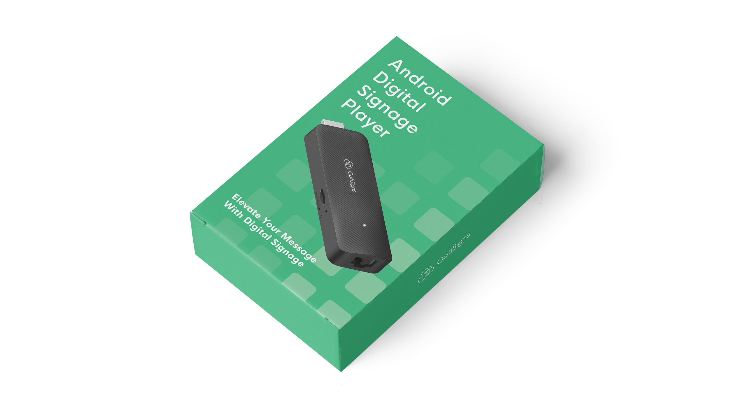
The new design takes a product-first approach, giving each panel a defined purpose rather than treating all surfaces as equal space for feature copy.
The front panel leads with the product centered, name and tagline clear, and establishing brand identity immediately. The back panel was simplified significantly: copy was shortened and restructured, and custom icons were designed to communicate key features at a glance, replacing the cluttered text-heavy layout. Imagery that obscured rather than clarified the product was removed and replaced with visuals that directly support product understanding.
The overall result is packaging that is cleaner, faster to read, and more aligned with how OptiSigns presents itself across other brand touchpoints.
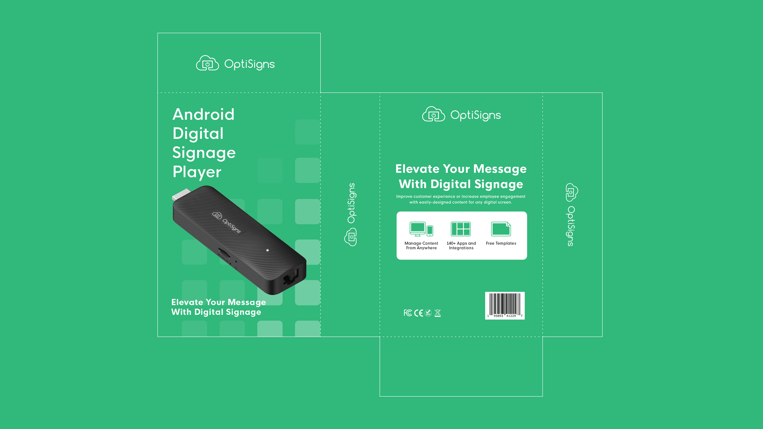
A dieline view of the final packaging showing all sides.