
UX / UI DESIGN
quincy college
Navigation and content redesign for a multi-campus community college. Restructured a dense navigation system and Areas of Study page to help students find programs and resources faster before a full site overhaul can be approved.
THE CHALLENGE
The existing navigation was dense and difficult to scan. The Areas of Study page lacked consistent structure, making it hard for prospective students to explore programs efficiently.
Any changes had to respect specific institutional requirements and work within the current site architecture because a full structural overhaul wasn't on the table yet.
RESEARCH
I reviewed navigation patterns and page layouts across community colleges and universities in the U.S. Three insights shaped the direction:
Long dropdowns increase cognitive load. Consolidating related links into fewer, better-organized groups improves scannability.
Persona-based paths help users reach relevant information faster.
Areas of Study pages work best when content can be sorted or filtered — by program type, credential, or interest area.
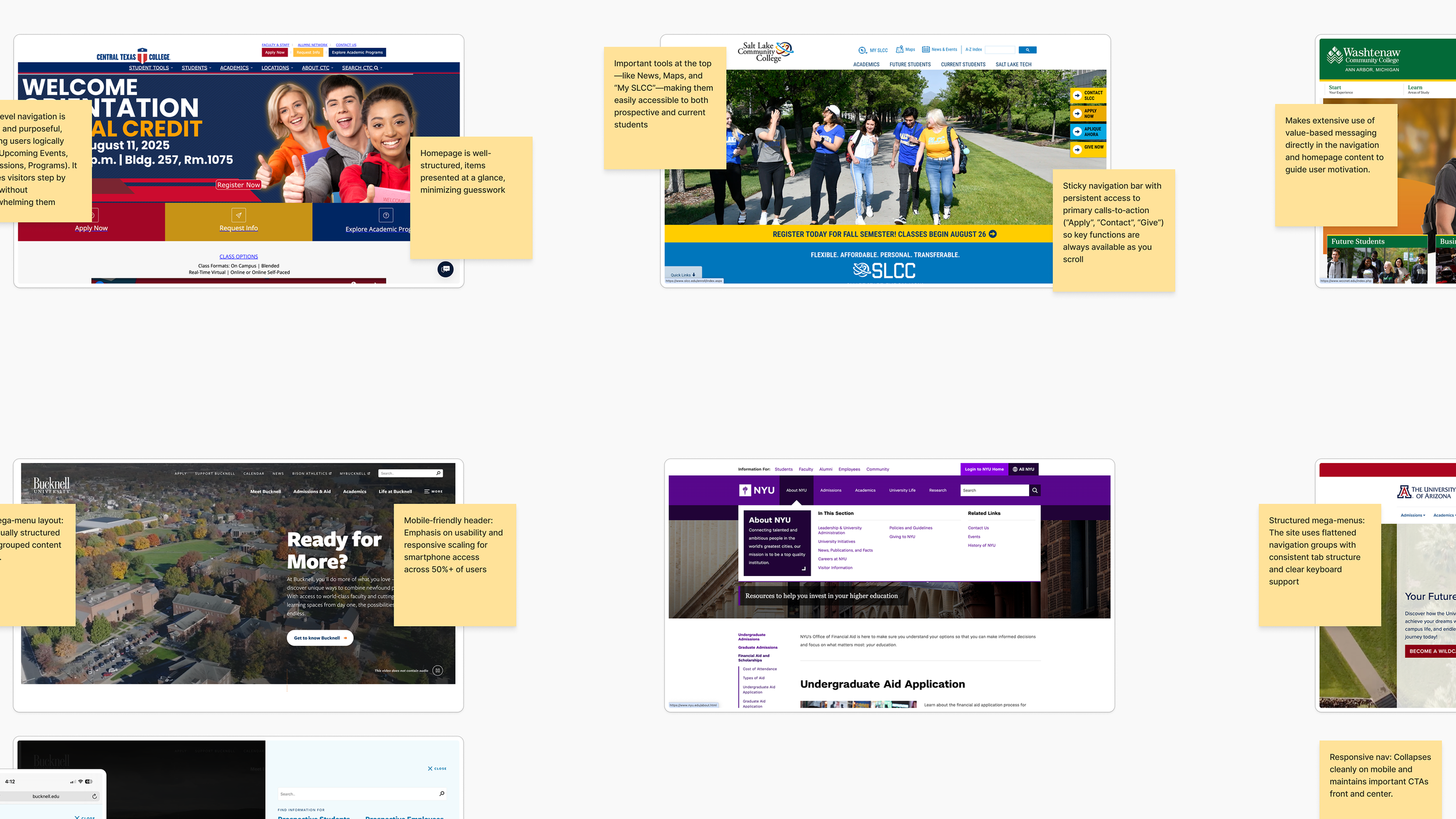
A small sample of research findings about navigation patterns from various higher education institutions across the U.S.
NAVIGATION REDESIGN
I audited the existing navigation to identify inconsistencies and pain points, then explored multiple models before refining based on feedback from the College's team.
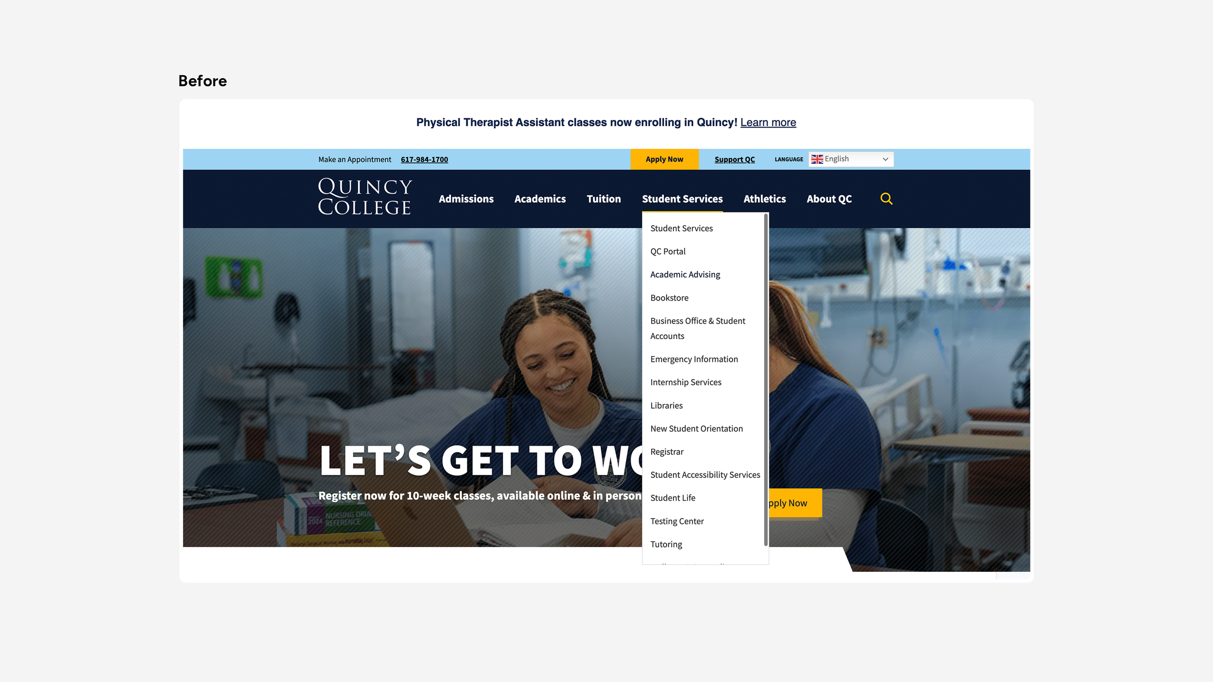
The navigation before the proposed redesign showing the Student Services dropdown. This category contained links to the Registrar’s Office, and Bursar’s Office, along with links to common resources students often need to access quickly.
The key decisions made to improve the navigation include:
Reduced complexity
Dropdown links were consolidated and reorganized to reduce clutter, grouping related content around user intent rather than internal site structure.
Prioritized recurring actions
Frequently accessed items like the QC Portal, Directory, and Emergency Information were moved into a dedicated Resources dropdown so users could find them without scanning the full menu.
Resolved duplicate links
The first link under each dropdown repeated the parent label. Rather than removing the redundancy unilaterally, the College was given two options: make parent labels clickable, or rename the repeated pages. This kept the decision in their hands while flagging it as a structural issue to resolve.
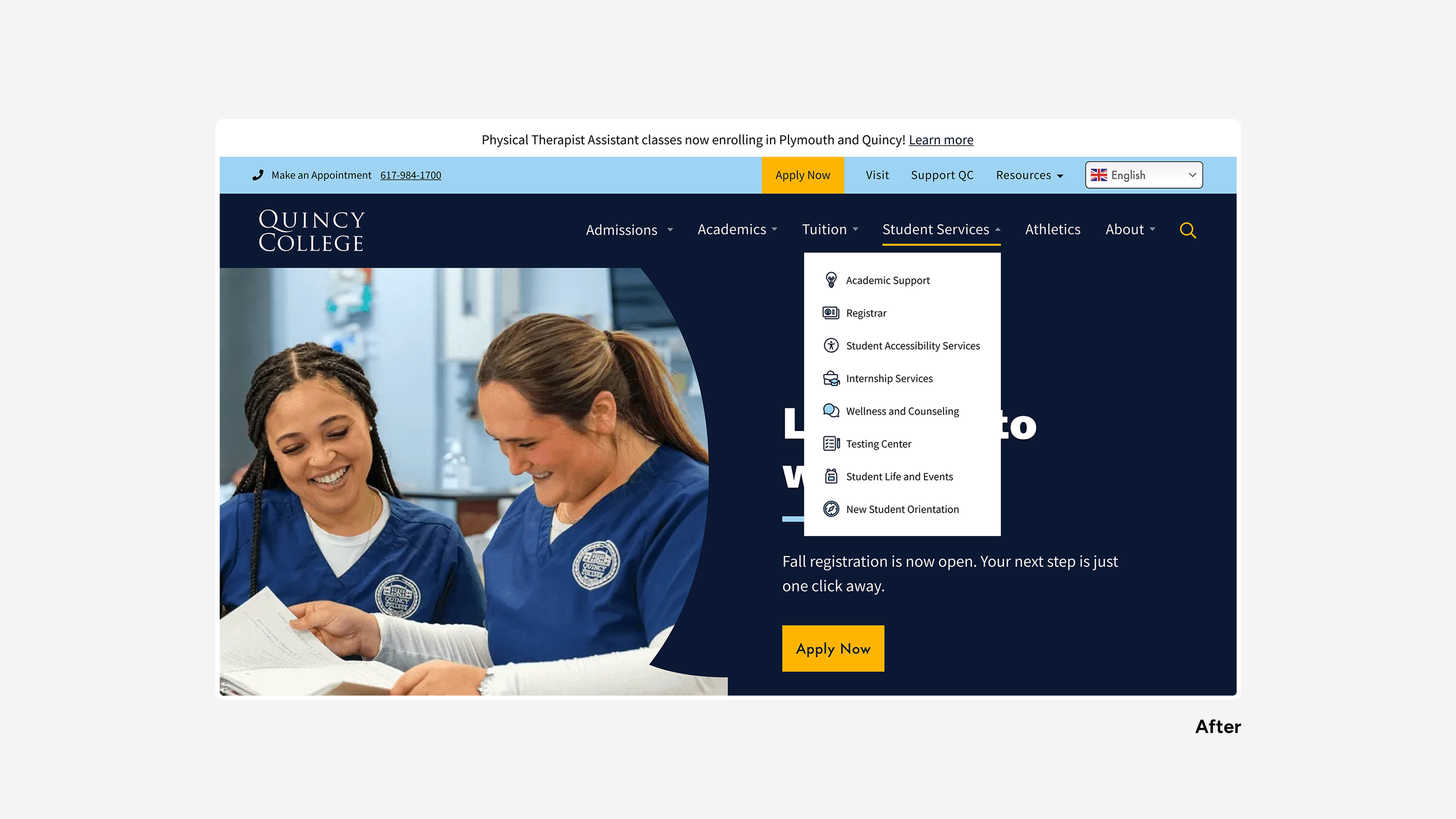
The proposed navigation of the Student Services dropdown. This category was reorganized by focusing its scope to contain only resources that directly support the student’s experience both at the start and throughout their academic journey.
Dropdown links were consolidated and reorganized to reduce clutter, grouping related content around user intent rather than internal site structure.
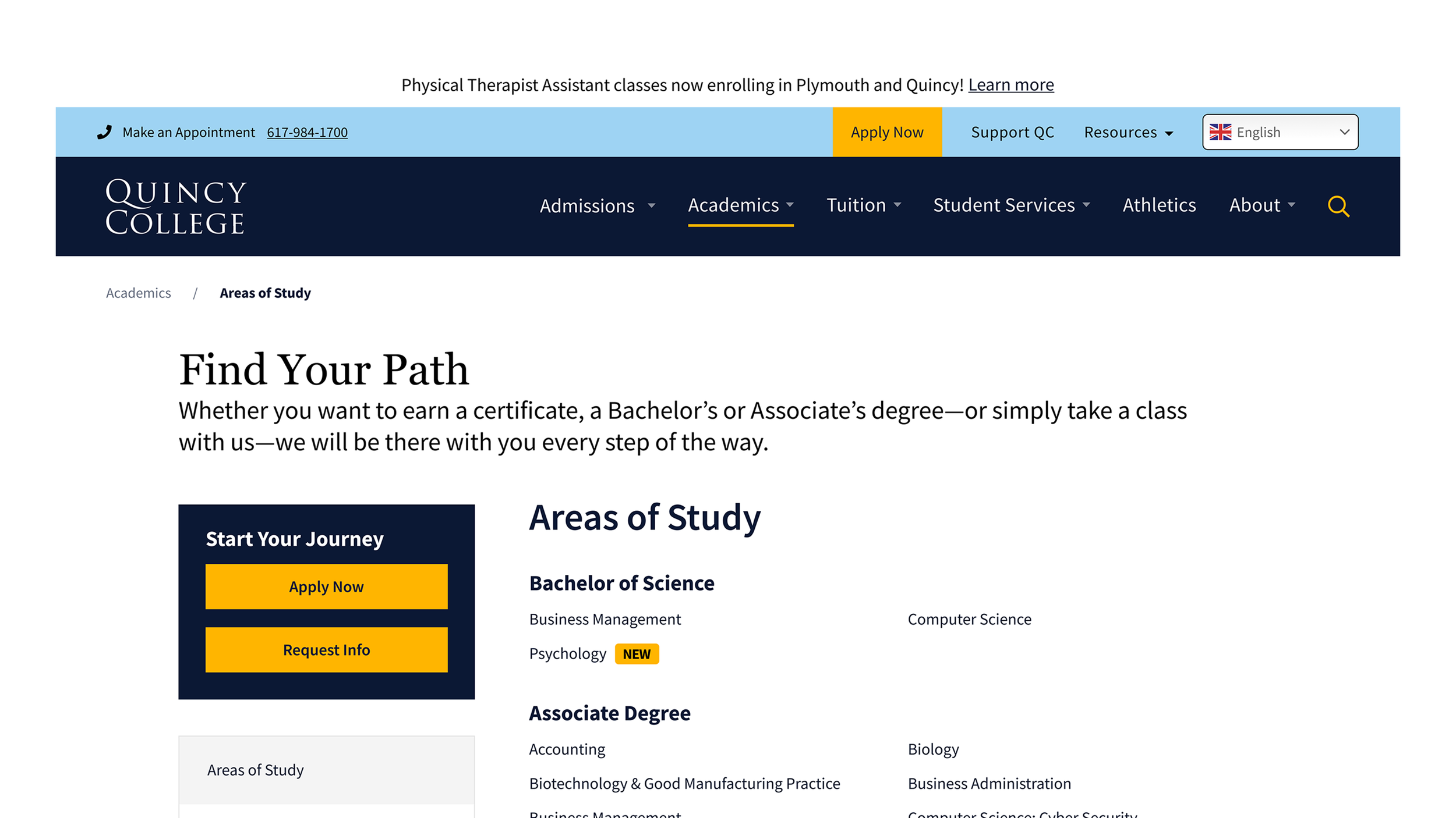
AREAS OF STUDY & PROGRAM PAGES
Merged Academics Overview with Areas of Study
Giving prospective students immediate context when they land on the page, rather than requiring an extra click to get there.
Streamlined the vertical menu
Reduced menu items to reflect the site's backend tab structure, improving scanability and removing navigation that didn't correspond to actual content.
Moved key content above the fold
Reducing drop-off by surfacing important information earlier on the page.
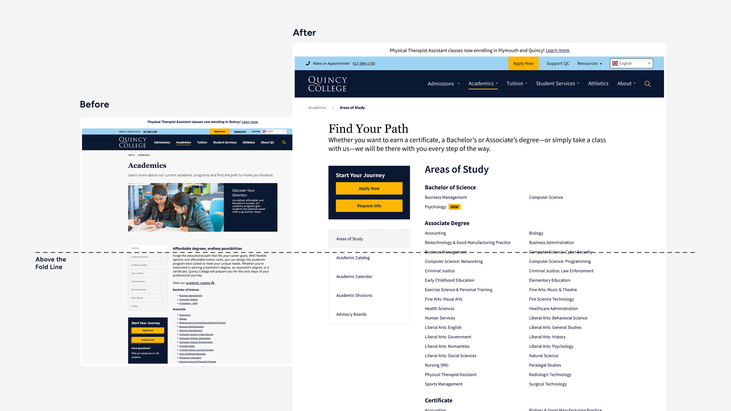
A before and after comparison of the content above the fold of the Academics / Areas of Study page.
Reducing drop-off by surfacing important information earlier on the page.
Added CTAs throughout
Calls to action were placed more prominently and distributed across the page to encourage applications and inquiries at natural decision points.Standardized program page templates
Two layouts were created: one for information-dense programs with images, and one for programs with lighter content. Both shared a consistent structure and hierarchy, giving the College a reusable, scalable system that reduced content management overhead.
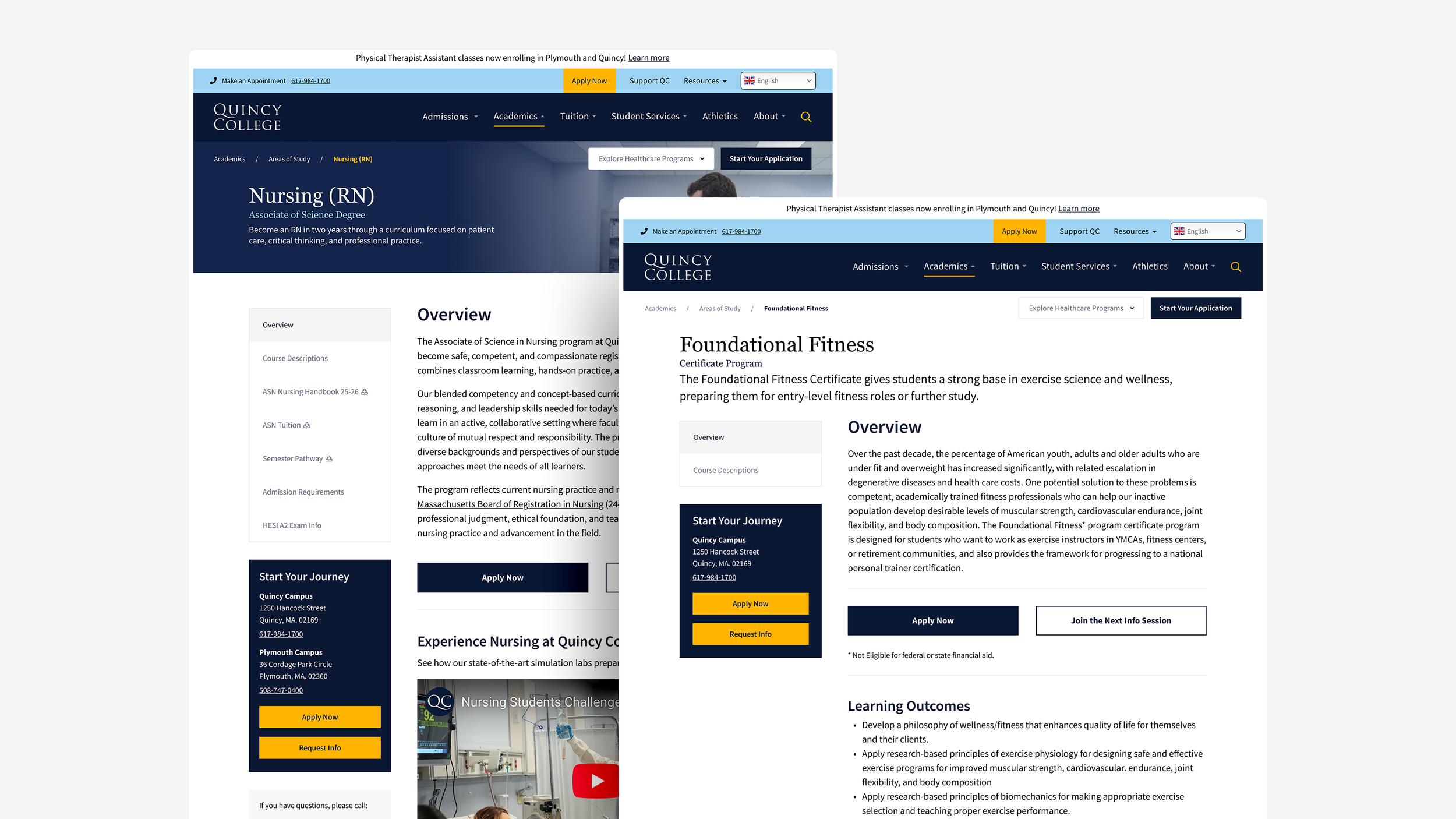
Two program page templates: one for content and image heavy programs, and one for programs with text-only content.
Although these designs have not been implemented, they were developed through stakeholder feedback and shaped to align with Quincy College's institutional goals and higher-education standards.