
UX / UI DESIGN
pollo campero
UX design for a mobile app serving the Ecuadorian market. Designed ordering, and delivery address flows using familiar patterns, and an authentication flow built to scale across multiple restaurant brands.
Pollo Campero is a Central American quick-service restaurant chain with locations across Latin America and the U.S. I designed core flows for their mobile app, including authentication, ordering, and delivery address entry, as part of a broader CMS-powered white label platform built to serve multiple restaurant brands.
THE CHALLENGE
Each flow had to meet Pollo Campero's immediate product requirements while functioning as a reusable, modular foundation for future clients on the same platform.
That meant every design decision had to serve Pollo Campero's customers, and hold up as a scalable pattern for other businesses.
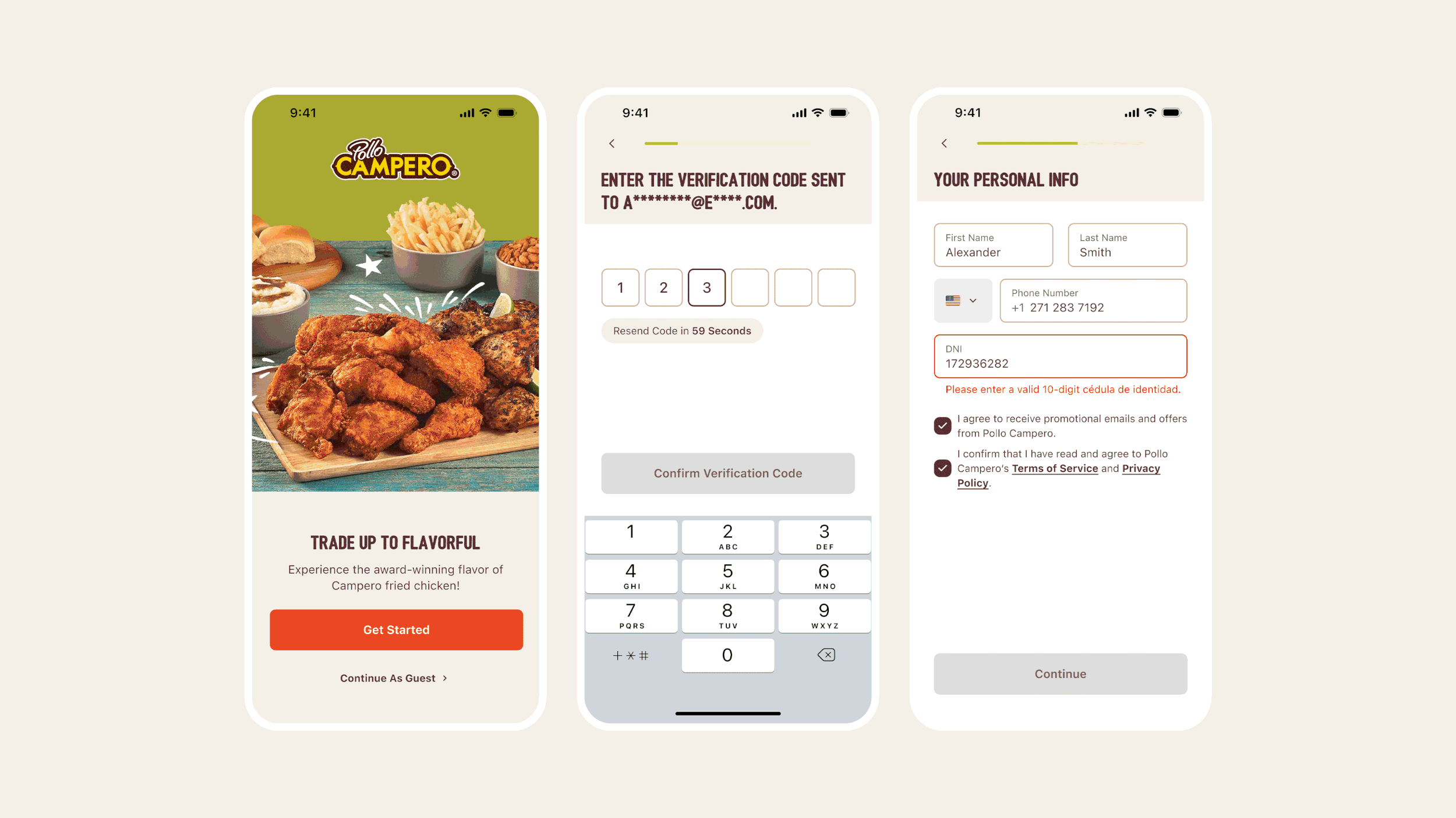
The authentication flow’s main entry screen and sign up flow with error states and edge cases.
AUTHENTICATION
The goal was a fast, clear account creation and login experience that supported multiple sign-in methods — phone, email, Apple, Google, and Facebook — without overwhelming users or fragmenting the flow.
I mapped out common and edge-case scenarios based on restaurant app research, covering account recovery, verification steps, and regional variations.
The UI was refined to align with Pollo Campero's brand guidelines while keeping components modular enough to be reused across other brands on the platform.
Key decisions:
Single entry point for all sign-in methods
Phone, email, and social logins were unified without creating a cluttered or confusing first screen
Reduced visual density during sign-up
Page clutter was minimized at the steps most likely to cause drop-off
Inline guidance and error handling
Real-time feedback was built in to prevent errors during account creation and reduce friction at critical moments
The completed flow was later adopted as the foundation of the authentication flow for the Carl's Jr. Mexico app, where it was further refined to meet the specific authentication needs of the different business and market.
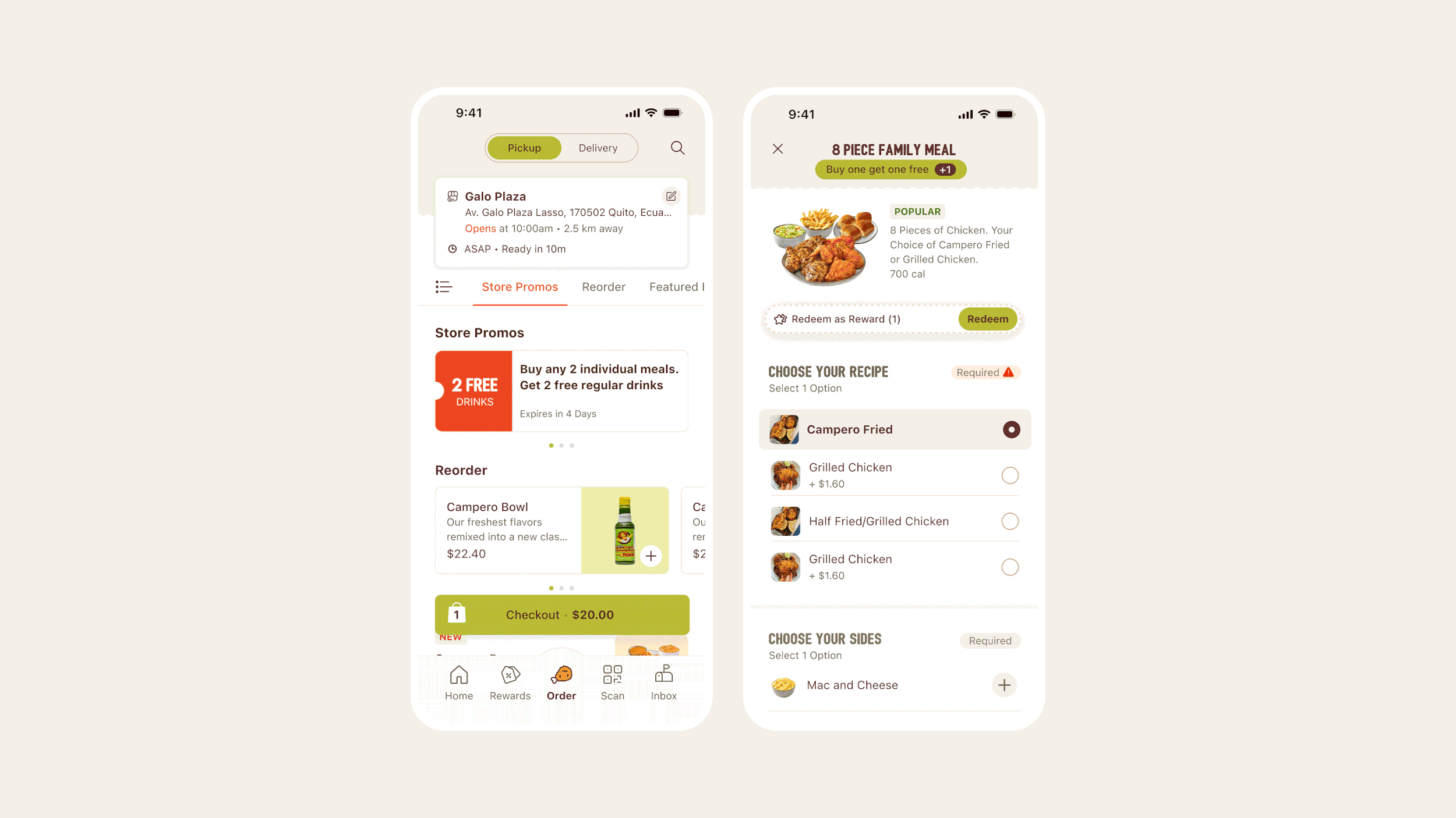
The ordering menu showing the segmented pickup and delivery options, and item customization components.
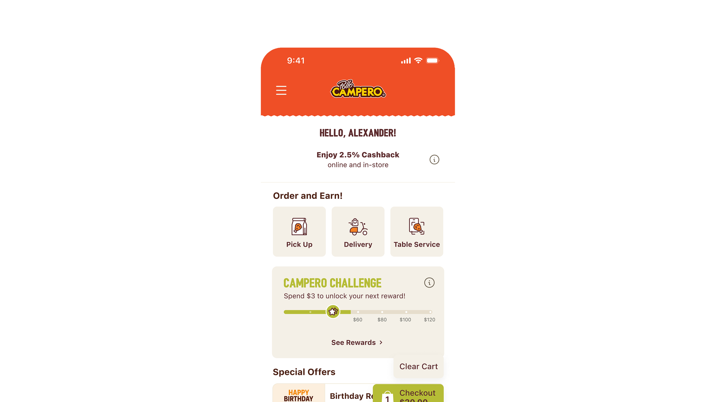
ORDERING
The ordering flow needed to support both pickup and delivery while handling complex menu customization and promotion logic within the constraints of a CMS-driven platform.
The flow went through multiple internal design reviews, with early concepts exploring different ways to surface order context and organize menus. The refined direction prioritized clarity and speed.
Key design decisions include:
Segmented control for pickup vs. delivery
Users could switch order types without restarting the flow, with store selection and promotions updating dynamically
Persistent order context at the top of the screen
Delivery or pickup details and order timing stayed visible throughout browsing and checkout to reduce uncertainty
Horizontal category navigation
Enabled faster scanning across large menus without overwhelming users with a single long vertical list
Adaptive customization components
UI patterns were matched to customization complexity: radio buttons for single-choice options, drill-down for nested add-ons, and quantity steppers for sides and extras. This kept the interface flexible without adding cognitive load.
Dedicated pickup location screen
Modelled after familiar patterns from apps like Starbucks to help users confidently select or change their pickup location
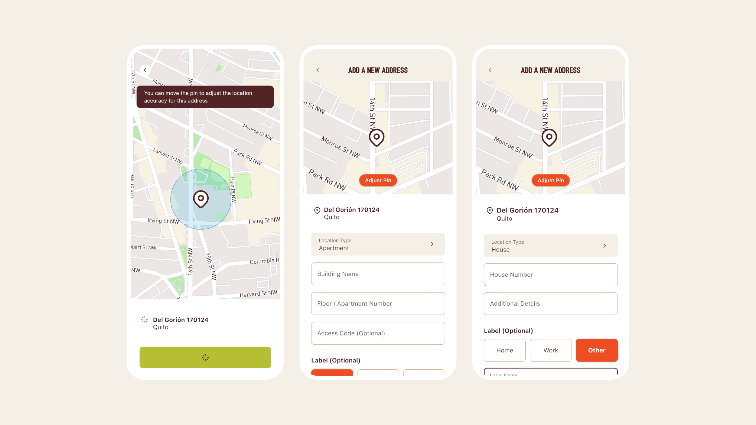
Delivery address flow with a map screen pin for users to point to their exact location, and contextual field variations common in other delivery service apps in the Latin American the market.
DELIVERY ADDRESS
The client raised a specific challenge early in the process: standard address entry doesn't work well in Latin America, where street addressing is inconsistent and delivery drivers rely heavily on live GPS navigation and landmarks rather than formatted addresses.
Research confirmed that address formats vary significantly by country, manual descriptions and landmarks are commonly used as supplementary information, and drivers depend on GPS rather than strict address matching.
The design solutions proposed include:
Flexible address entry
Autofill adapted to how addresses are actually inputted in Latin American markets, rather than enforcing a North American format
Map-based pin selection
Users set a pin directly on the map to confirm location accuracy independent of address formatting
Contextual address fields
Fields adapted based on location type (apartment, gated community, office) to capture relevant details without adding unnecessary friction
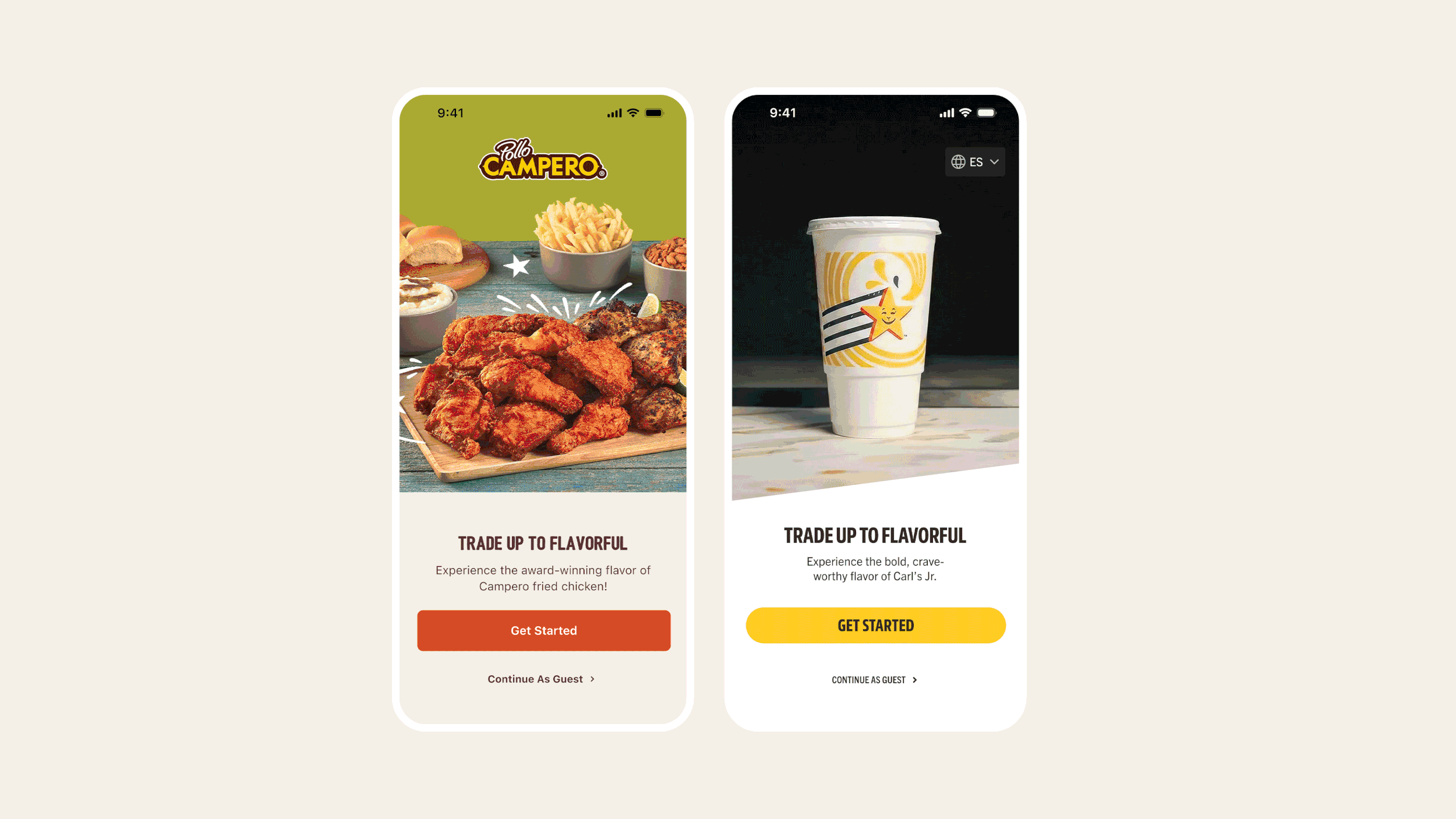
A comparison of the authentication flow of the Pollo Campero and Carl’s Jr. Mexico applications.