
UX / UI DESIGN
photo builder redesign
UX redesign of an in-house photo product builder for a national retail platform. Modernized an outdated tool to improve the customer creation experience and accelerate internal theme production workflows.
Walmart Photo Center allows customers to create personalized products—prints, photo books, calendars, mugs, and gifts—through an in-house Photo Builder tool.
As the primary designer on the platform, I led a full redesign of the builder to modernize the customer experience and improve the internal workflow for creating and managing themes.
THE CHALLENGE
The existing Photo Builder was outdated and difficult to navigate compared to competitors like Canva, Mixbook, and Shutterfly. Customers struggled with product customization, and the clunky system slowed down internal design workflows when building and maintaining themes at scale.
Another problem was inconsistency. Different product types used different builders with different interaction patterns, creating a fragmented experience that varied depending on what a customer was trying to make.
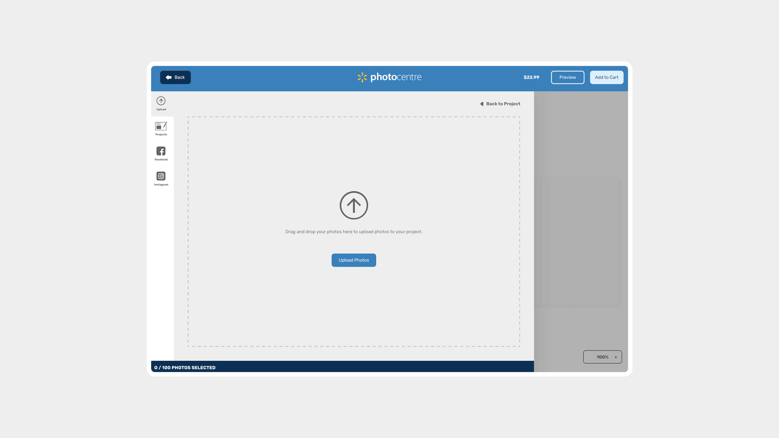
The first step to any product is the “Add Photo” options where users can upload photos using different methods.
CUSTOMIZABLE PRODUCTS
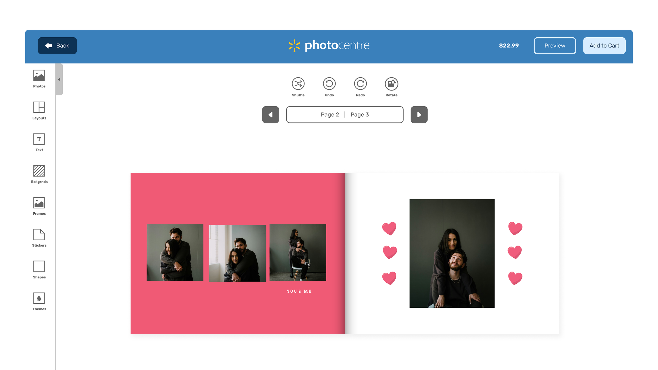
The redesign began with the full custom builder—used by most personalized products like photo books, greeting cards, blankets, and mugs—because this was the most complex builder and the one with the most internal usage for theme creation.
The decisions made here became the foundation for everything else.
The redesign focused on improving hierarchy and introducing familiar interaction patterns to reduce the learning curve without sacrificing the flexibility customers needed.
Every decision was evaluated against two audiences: the customer creating a product, and the internal team building and managing themes at scale.
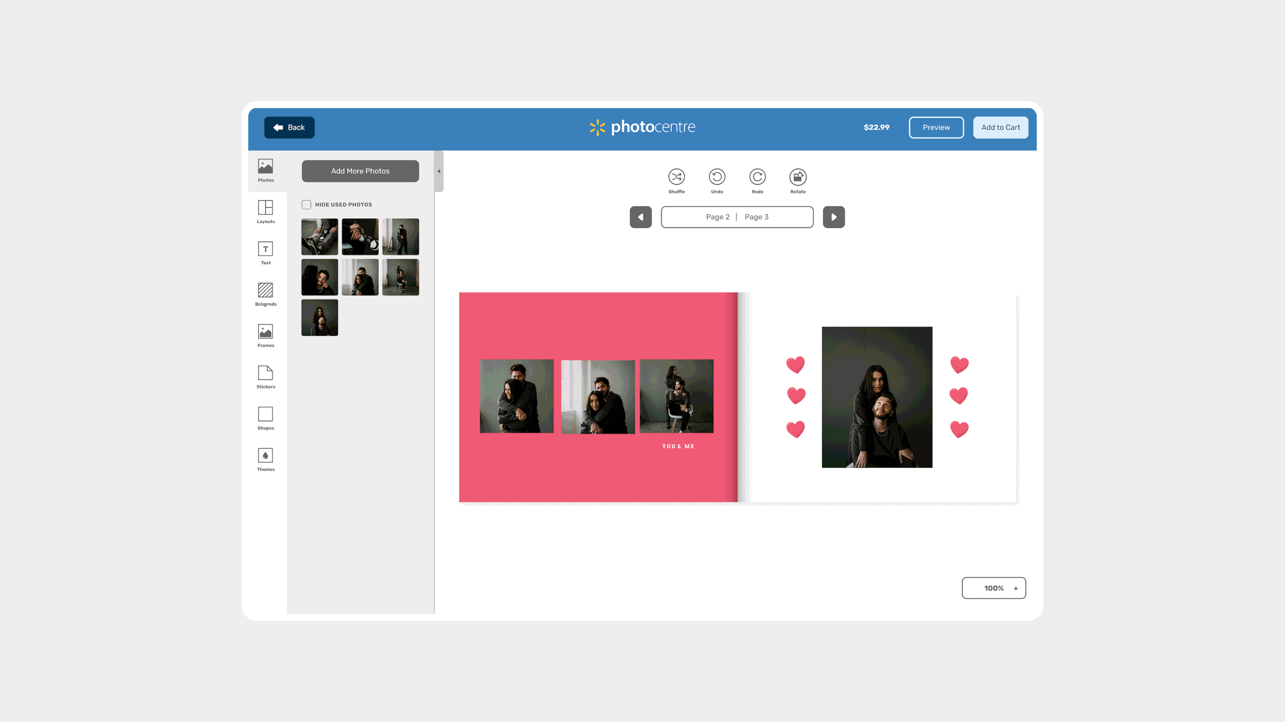
A gif showcasing the different tabs in the asset panel, and context-aware controls on the top of the product.
KEY DESIGN DECISIONS
Expanded Asset Panel
Layouts, text, and themes were consolidated into a single panel with more options per category, making customization faster and easier to navigate.
Context-Aware Controls
Page-level controls sit at the top of the interface; asset-specific options appear at the bottom. Relevant tools are always accessible without cluttering the view.
Dynamic Frames & Backgrounds
The original builder only supported static image assets. The redesign introduced flexible shapes and unlimited solid colour options, giving themes significantly more range.
Search Across Assets
With thousands of assets in the library, a search bar was added to support fast discovery for both customer-facing creation and internal theme-building workflows.
Updated Iconography
A refreshed icon set with labels improves scannability and removes ambiguity across the interface.
Two different photo product builders: Prints & Enlargements, and Express Canvas, that have different patterns and user experiences.
EXTENDING THE SYSTEM
Two structural decisions from the custom builder became the consistent foundation applied across all other product types: the left-hand asset panel and context-aware controls. The specific options available change depending on the product, but the pattern is identical
A customer who has used the photo book builder already understands how the other builders work. This was the core consistency goal: not visual uniformity for its own sake, but a transferrable mental model that compounds across every product a customer touches.
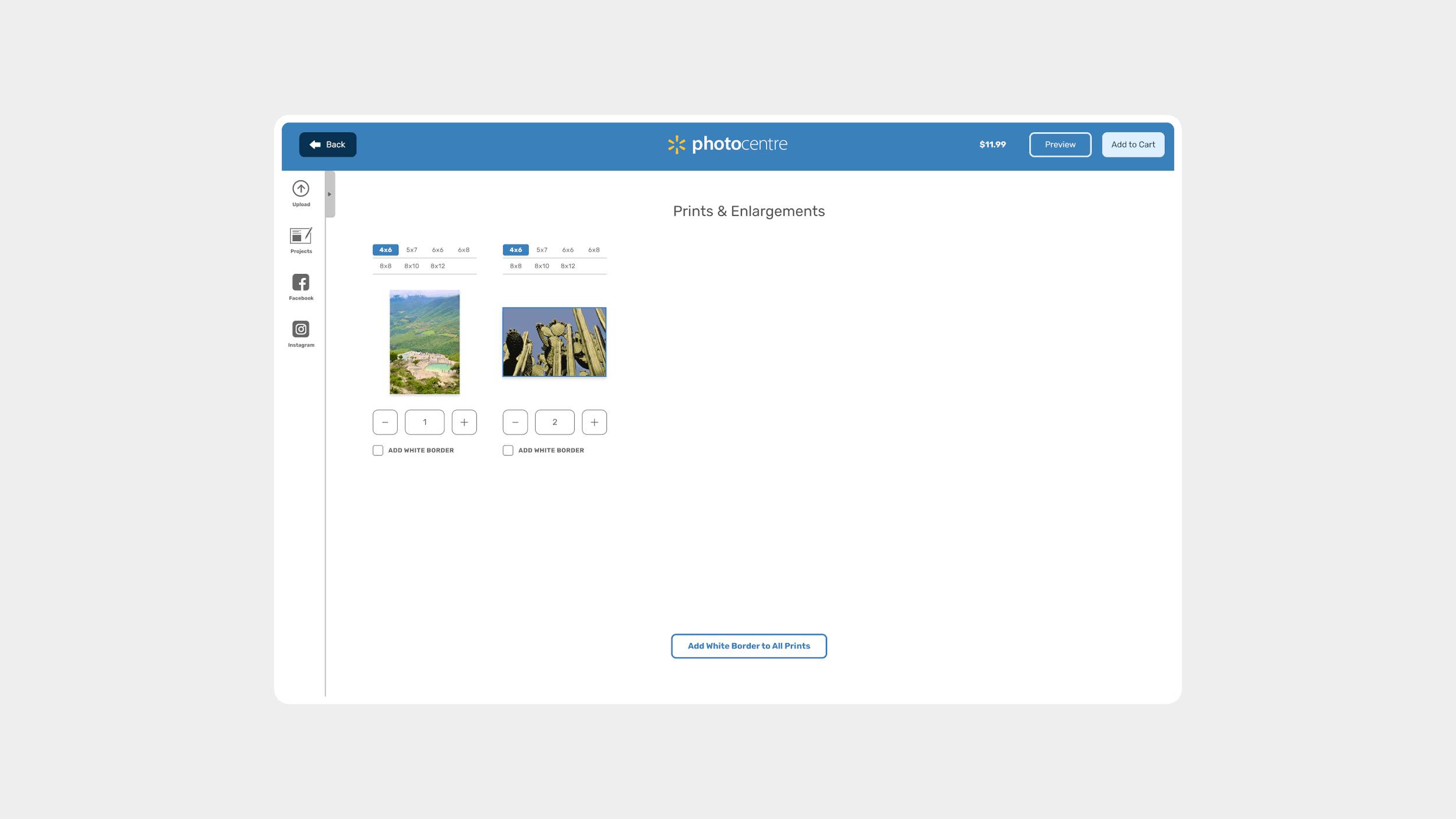
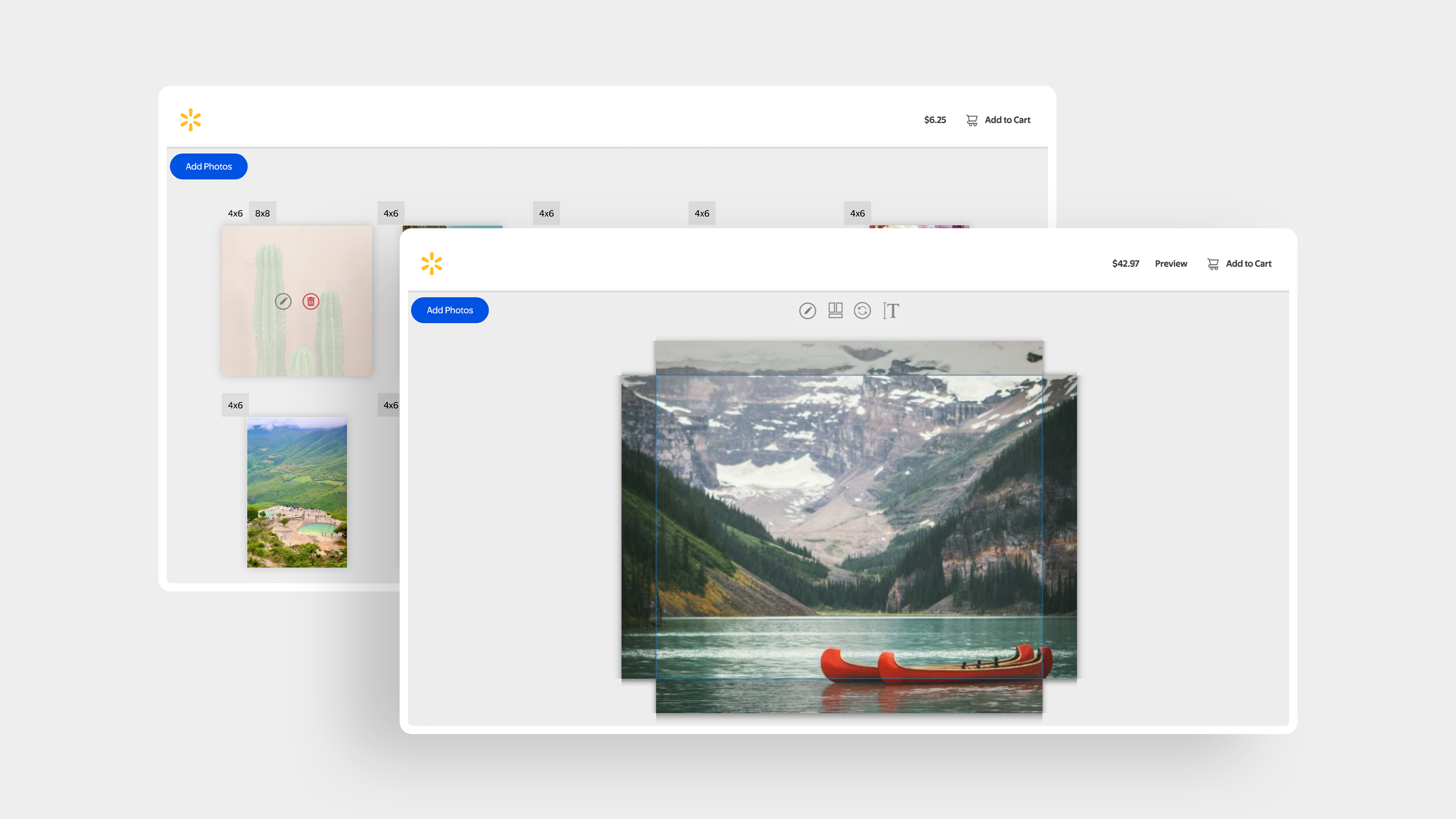
The redesigned print product builder gives the user all the options they need including: print sizes, print quantity and adding white borders to their photos.
PRINT PRODUCTS
Print products were simplified to match what customers actually need: a focused left-hand panel containing only photo uploading options. No unnecessary assets or customization options that don't apply to prints.
More importantly, the experience was redesigned so customers can choose print sizes, adjust quantities, and delete photos all on a single page. Previously, selecting a size or adjusting a quantity required navigating into a separate editing view, which added clicks for actions customers needed to take constantly.
The new design surfaces those most-used controls in context, where customers are already making decisions about their photos, and creates a natural upsell opportunity.
A customer who wants 100 photos and selects 4x6 prints can quickly add larger sizes or additional quantities to individual favourites without leaving the flow or re-entering an editing state. The path from browsing to upgrading is immediate.
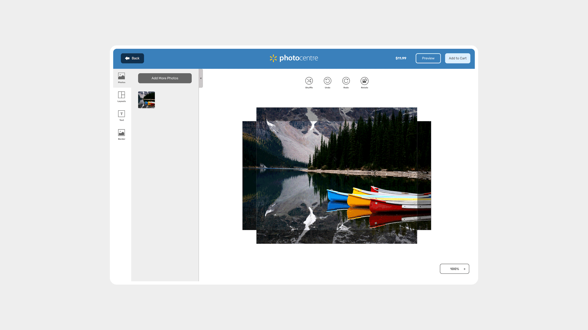
The Express Canvas builder showing the specific use for the asset panel to include photos, layouts, text and border. For a simple product like cavas, context-aware controls include only the ability to quickly shuffle multi-photo layouts, and change canvas orientation.
EXPRESS PRODUCTS
Products like Express Canvas sit between print simplicity and photo book customization. Customers can add borders and text, adjust photo layouts when multiple photos are added, but do not require the full asset library of a fully customizable product. The original builder required customers to enter an editing popup to make specific changes, and updates weren't visible until applied and dismissed from the menu.