
BRAND IDENTITY • EDITORIAL • UX /UI DESIGN
lugar magazine
A visual identity, print editorial and website for a travel publication digging into the history, culture, and people behind a destination. Lugar is for travellers looking to gain a deep understanding for a place, not just collect stamps on a passport.
THE CHALLENGE
A portfolio project with the goal of showcasing different skill sets: branding, editorial and website design under one viable product.
THE CONCEPT
Lugar, meaning place in Spanish, is a travel publication built for travellers who want to learn, not collect. Lugar isn’t in the business of telling readers where to go, but uncovering what’s under the surface—the version not in guidebooks, and the one a local will tell you about. Each issue takes that deep-dive approach to a single city, or thematically across several places at once, but the job of each is always the same: go past the postcards and past whatever is trending.
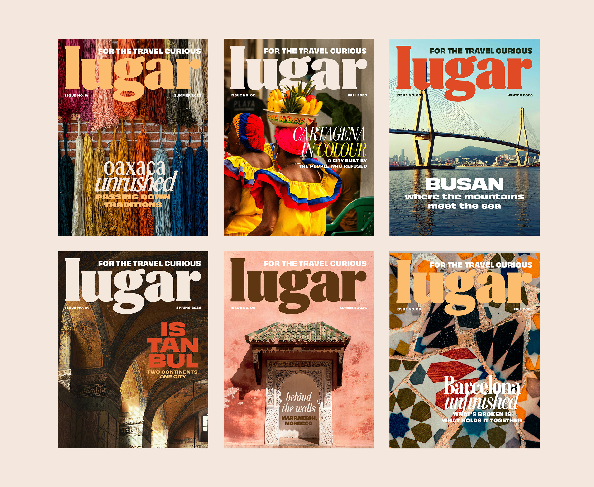
Six covers, six different visual languages, one mission.
The mission isn’t “here’s where to go.” It’s “here’s what you’re missing.”
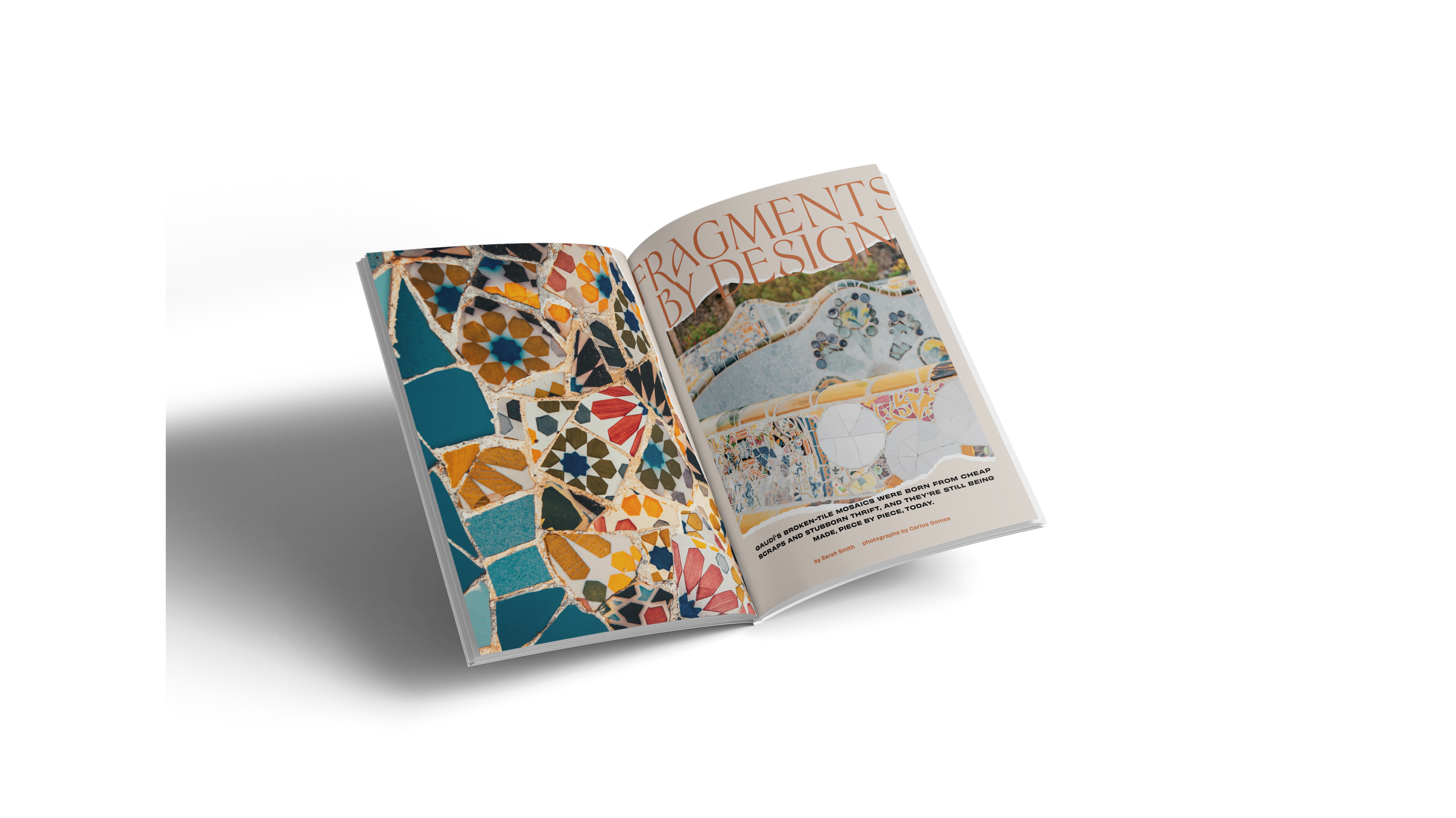
Five pillars hold that mission steady: Roots, Local Knowledge, Culture, Table, and In Motion, and carried through six issues, from Barcelona's broken-tile mosaics to the walled medinas of Marrakech.
That mission set the brief for everything that followed. Lugar had to feel warm, human, and inviting. It is not a corporate or a lifestyle brand, but one with substance, texture, and life. Identity, layout, and website had to answer to that brief, not just to “travel magazine.”
VISUAL IDENTITY
Lugar’s identity has to survive contact with a lot of different surfaces without losing the character that makes it feel like Lugar and not just any travel brand or publication.
A contemporary logo
The wordmark is a modified version of a vintage style serif to evoke nostalgia and avoid looking dull or corporate. I adjusted the letterforms and reshaped the ear of the “g” to make space for text that need to run around the logo.
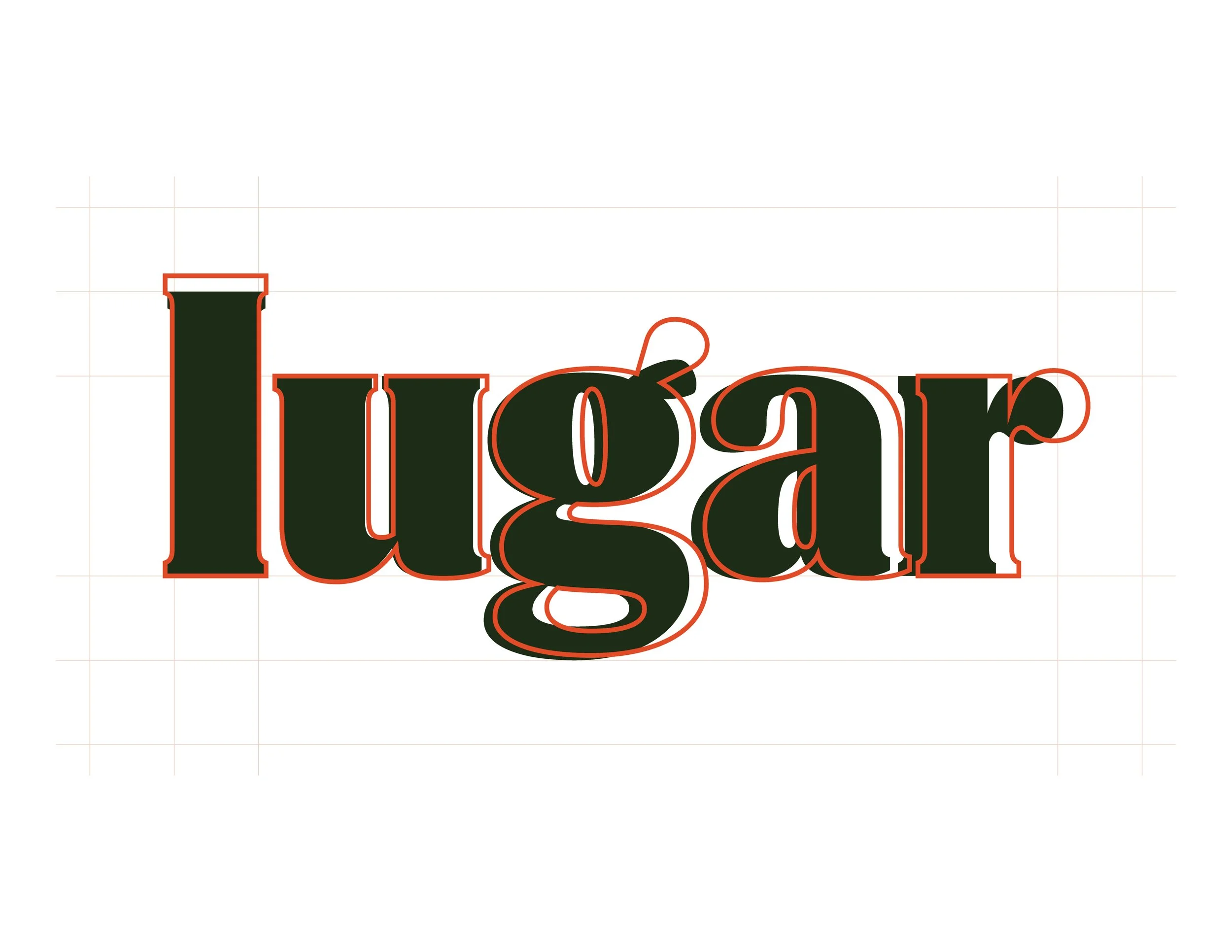
Original font proportions in outline, and the logo’s final lockup in solid with the “g” reshaped to clear the tagline running above it.
Two typefaces, a lot of style
The main typography uses retro-inspired fonts that give Lugar a wide typographic palette to use across different visual themes and mediums. Obviously Variable is a bold, playful, humanist sans serif and Benton Modern Display is a sleek, modern serif font.
Every piece of the identity answers back to the same brief: warm and human without being too soft, and confident without being corporate.
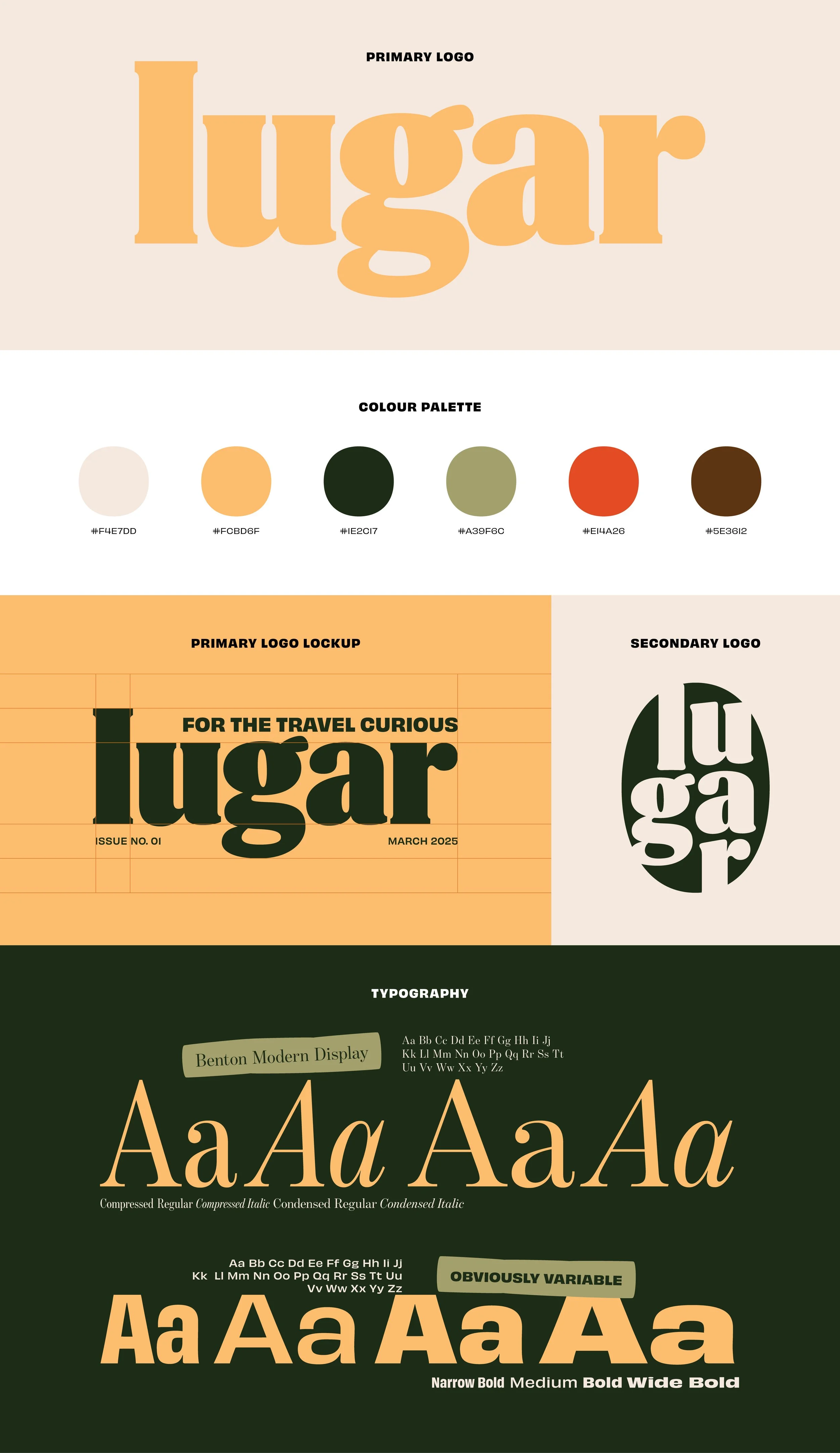
Full visual identity sheet with palette, lockup and type specimen.
EDITORIAL DESIGN
A magazine covering a different city or theme every issue does not get to use the same visual direction, so the challenge was building a system flexible enough to let every issue and article feel distinctly its own, while still feeling distinctly “lugar” from issue to issue.
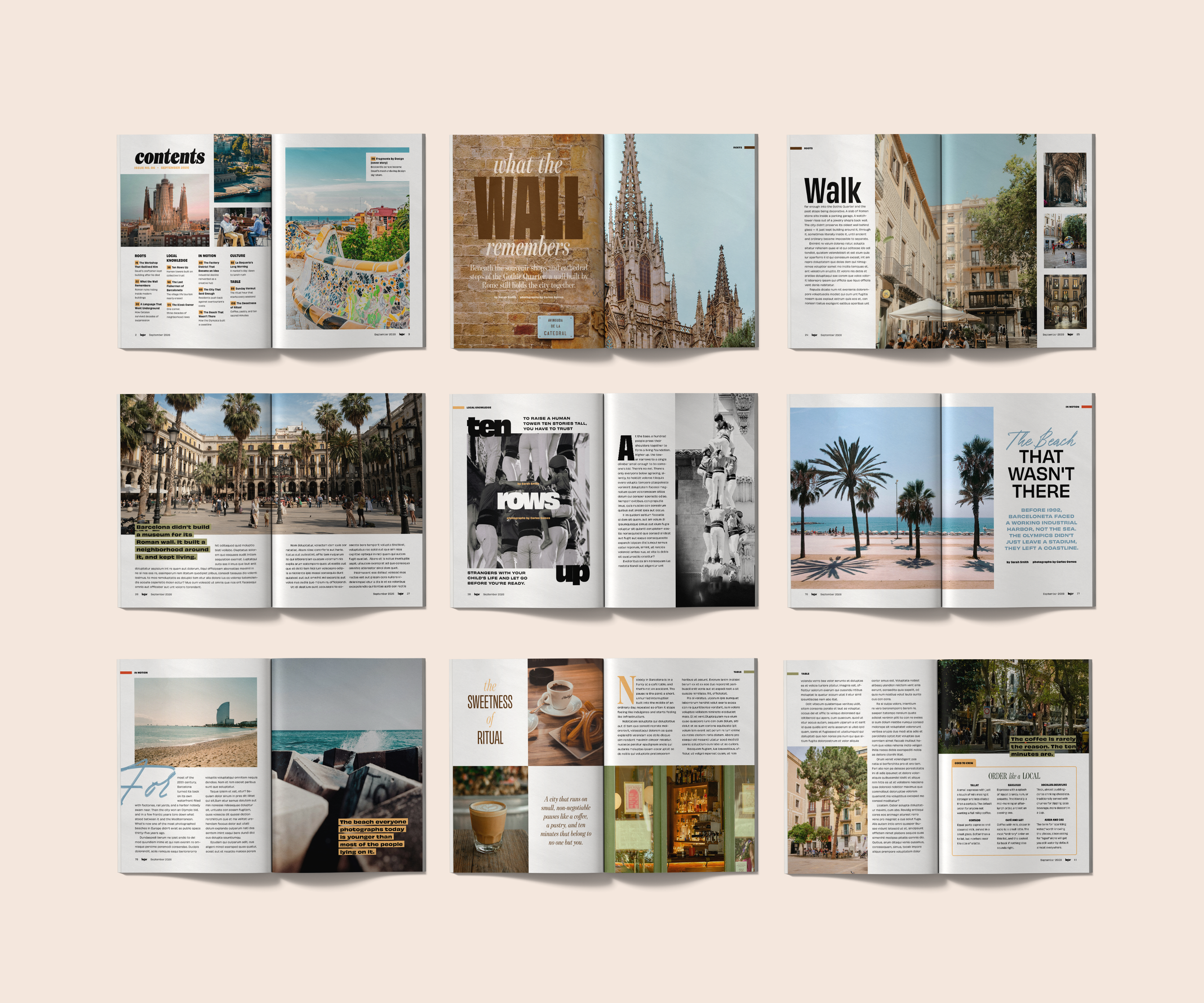
An email gif promoting new sizes for an existing photo print product.
WEBSITE DESIGN
The website targets a different audience than the magazine. A reader who owns an issue or subscribed to the magazine has already bought into the brand, but someone landing on the site probably hasn't heard of Lugar at all. Every structural decision on the site had to account for that colder starting point.
The site has to earn interest before the magazine ever gets a chance to reward it.
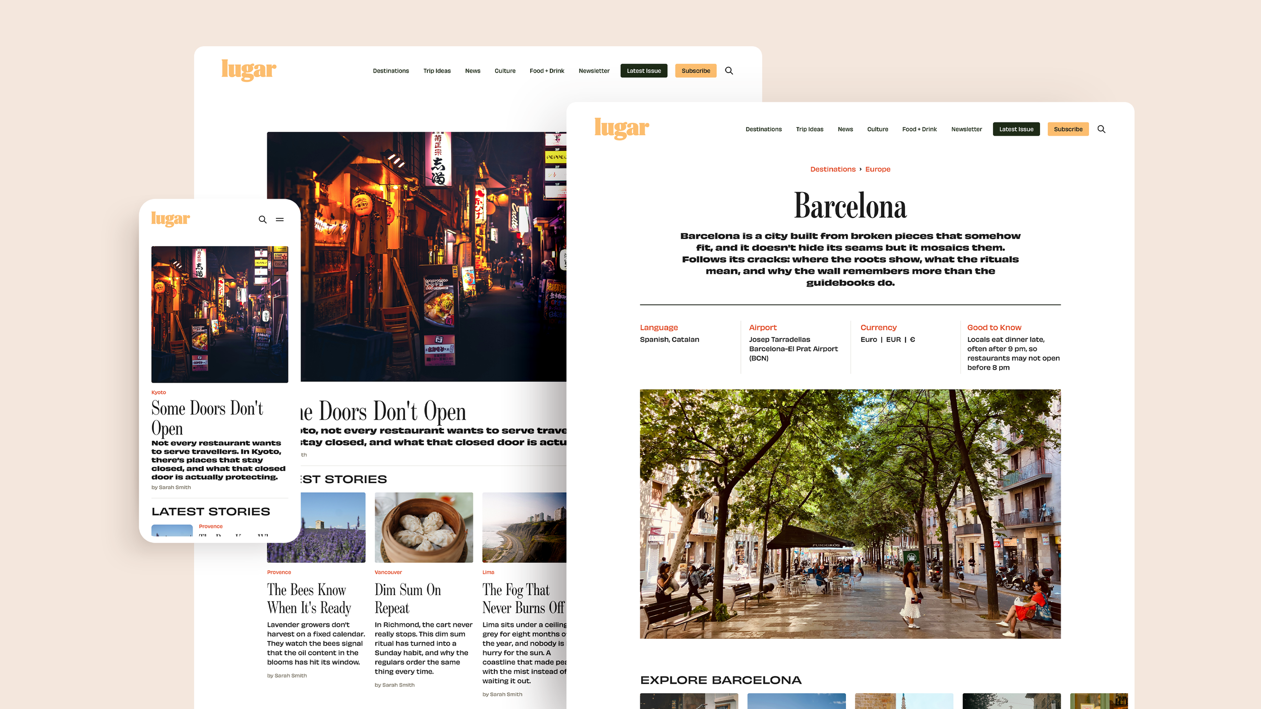
Homepage, Barcelona destination hub and category pages.
Navigation is simplified and separated from the pillar system
The site needs to work on task-based paths without requiring a first-time visitor to know what "In Motion" means. Pillar language is saved for inside the magazine, where the reader is better oriented.
The Latest Issue is separated from the archive
Folding everything into one page was messy and long. Keeping the current issue visible on its own also gives a non-subscriber a clear answer to what they are signing up for before committing to anything.
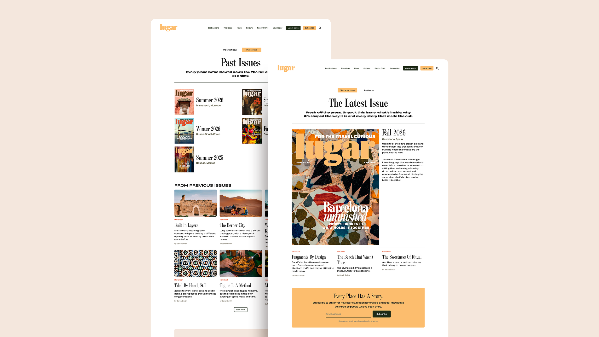
The Latest Issue landing page and Past Issues archive page.

