UX / UI Design
Quincy College
Role • UX / UI Designer
Focus • Navigation and Areas of Study
Platform • Website
Help students navigate the website faster by improving navigation structure and organize content consistently.
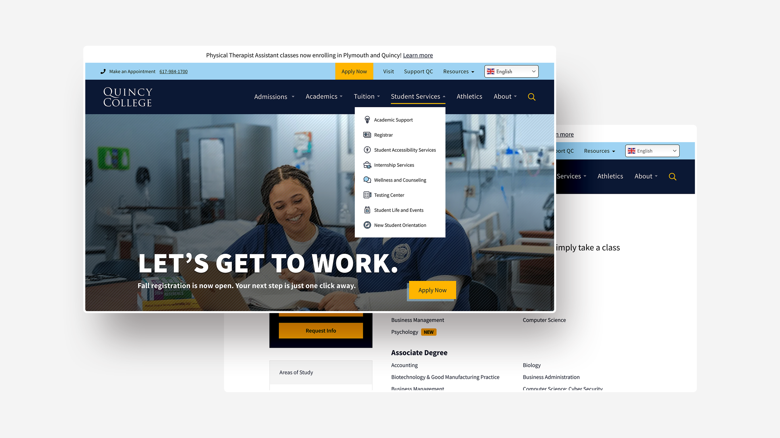
Challenge
Simplify the dense navigation bar and Areas of Study page for faster discovery and improve clarity without creating big structural changes until a full redesign can be approved while respecting specific institutional requirements.
Research
I reviewed the navigation patterns and page layouts of community colleges and universities across the U.S. and found the following insights:
Navigation is most effective when long dropdowns are avoided and related links are consolidated to reduce cognitive load.
Persona-based paths help users find relevant information more quickly.
Areas of Study pages are commonly organized using sorting and filtering methods, such as alphabetical order, program interest, location, or credential type.
I audited the existing navigation to identify pain points and inconsistencies then explored multiple navigation models and content structures. These concepts were refined through internal reviews with the College’s team based on the following key design decisions.
Navigation Bar
Reduce Items And Complexity
Consolidated and reorganized dropdown links to reduce clutter, and grouped related content to better align items with user intent and common tasks.
Prioritize Recurring Actions
Frequently used actions such as QC Portal, Directory, Emergency Information are placed in a Resource dropdown so users can find them quickly without scanning long menus.
Duplicate Links
The first link under each dropdown repeats the parent label. To reduce redundancy, Quincy College was given the option to make parent labels clickable, or rename the pages.
Combine Overview With Areas of Study
Merged Academics Overview with Areas of Study to give prospective students immediate context when exploring programs.
Streamline Vertical Menu
The number of menu items were reduced to reflect the website’s backend tab structure to improve scannability and minimize unnecessary navigation.
More Content Above the Fold
Information is placed higher on the page to reduce drop offs and help users surface important information quickly.
Areas of Study and Program Information
Additional CTAs to Encourage Application
CTAs are placed more prominently, and added throughout different areas of the page to encourage applications and inquiries.
Program Page Layouts
Standardized program page templates: one for information-dense programs with images and one for programs with lighter content and no available images.
The layouts shared a consistent structure and hierarchy to allow flexibility in content depth and give the College a reusable, scalable system that reduced content management.
Although these designs have not been implemented, they were shaped by stakeholder feedback to ensure alignment with Quincy College’s specific institutional goals and higher-education design standards. This work established a foundation for how to organize academic content and informed future conversations around website improvements.